


Etsy | Broader Horizons
Building Outside The Box
Originally limited by a narrow storefront name and an early rebrand that felt more childish than handcrafted, this project redefines the shop as Solgato — a versatile brand. By shortening the name and pairing subtle textures with a vibrant palette, the new identity bridges past charm with future growth. The result is a cohesive, playful system built to expand into new product lines without losing the brand's original heart.


Logo Evolution |
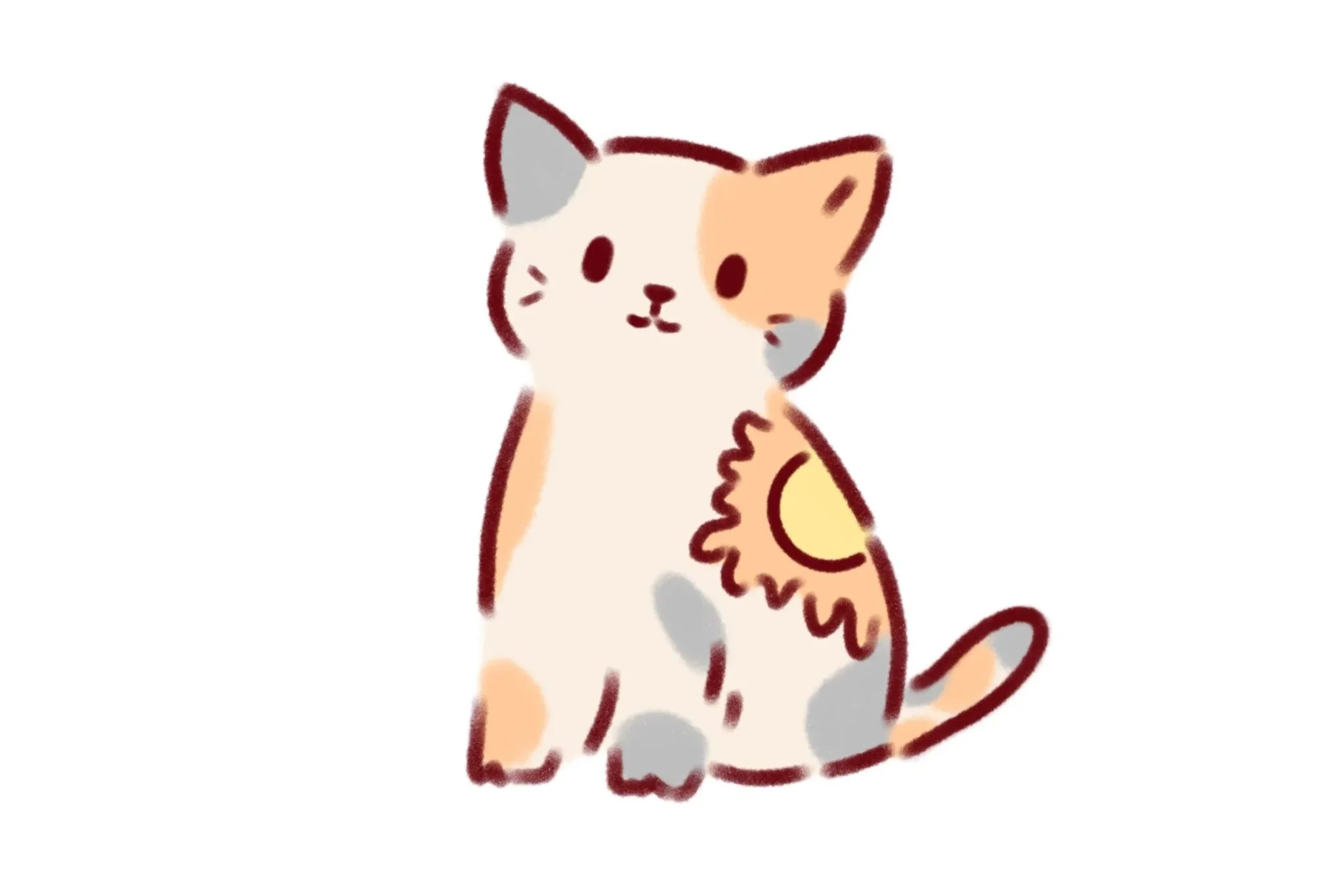
Original
The initial identity sought to bring the name SolGato (Sun Cat) to life through a brand mascot — a cat featuring a distinct sun marking. While approachable, relying solely on a mascot limited the storefront's visual scalability across broader product lines.

First Revision
Transitioning toward a wordmark-driven identity, this iteration prioritized a playful, friendly aesthetic through rounded typography and custom sun and cat iconography integrated into the letterforms. However, the system lacked structural grounding and hierarchy, leaving the brand feeling unfinished.

Final Revision
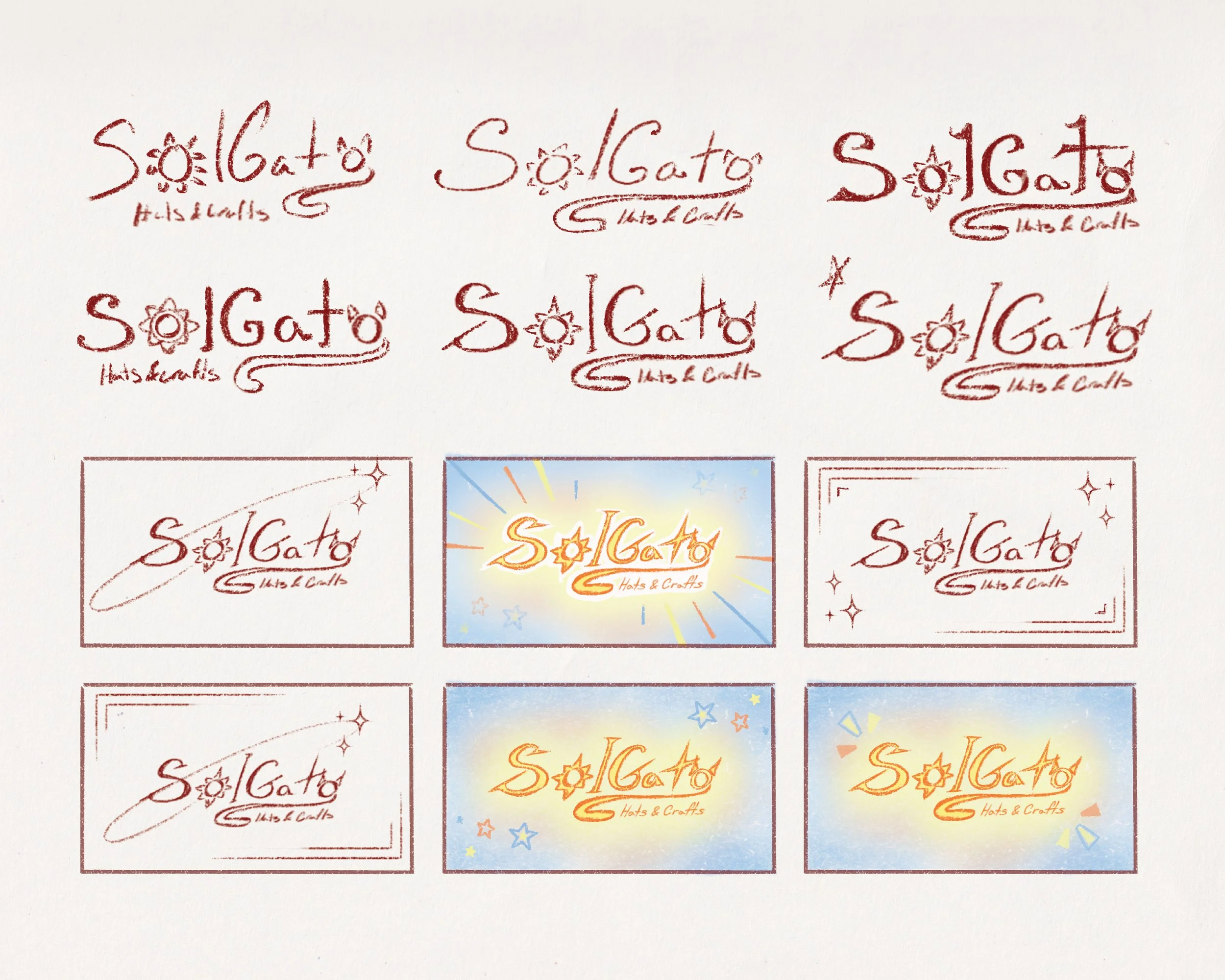
Revisiting the logo with a refined strategy, I introduced subtle handmade textures, using a rough, colored-pencil finish to establish an organic, crafted identity. Retaining the signature orange accents and iconographic letterforms, I restructured the secondary typography to improve visual hierarchy and brand versatility across digital storefronts and physical packaging.
Early Exploration |
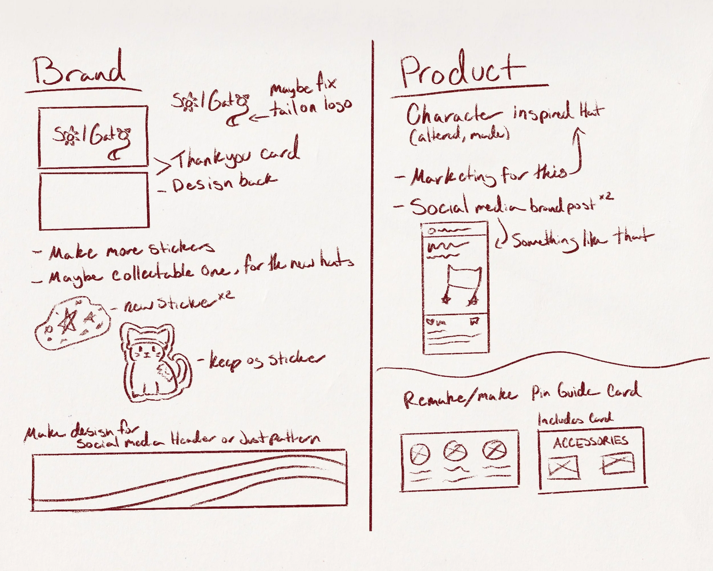
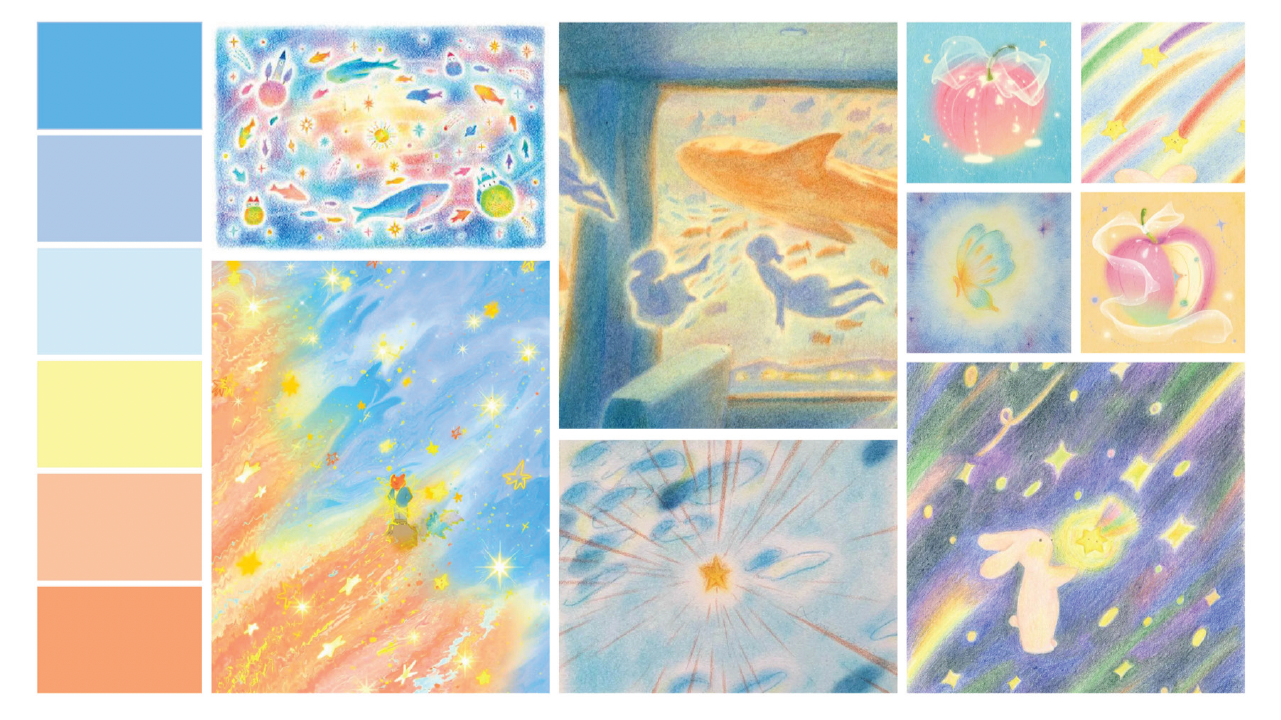
I began by gathering visual inspiration to build a strong moodboard as my foundation. Drawn to a handcrafted, colored-pencil aesthetic, I focused on soft tones and subtle gradients. Prior to sketching, I established a clear scope of deliverables for both the brand identity and physical product touchpoints to guide the design execution.
The Rebrand Structure |
Playful Passion

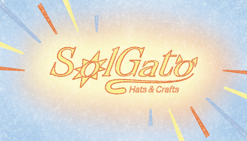
The updated logo adopts a handcrafted approach using textured outlines while retaining strong visual connections to the brand’s name. Supporting elements like stars and sunburst accents further emphasize the playful, approachable nature of the brand.
Vibrant & Grounded Palette
To maintain brand continuity, I retained the original vibrant orange to evoke warmth, creativity, and energy. To connect directly with the 'Sol' (Sun) identity, I introduced a sunny yellow and a soft, grounding light blue — creating a harmonious contrast where the yellow keeps the aesthetic bright and welcoming, while the blue provides visual balance.
Confidence & Contrast
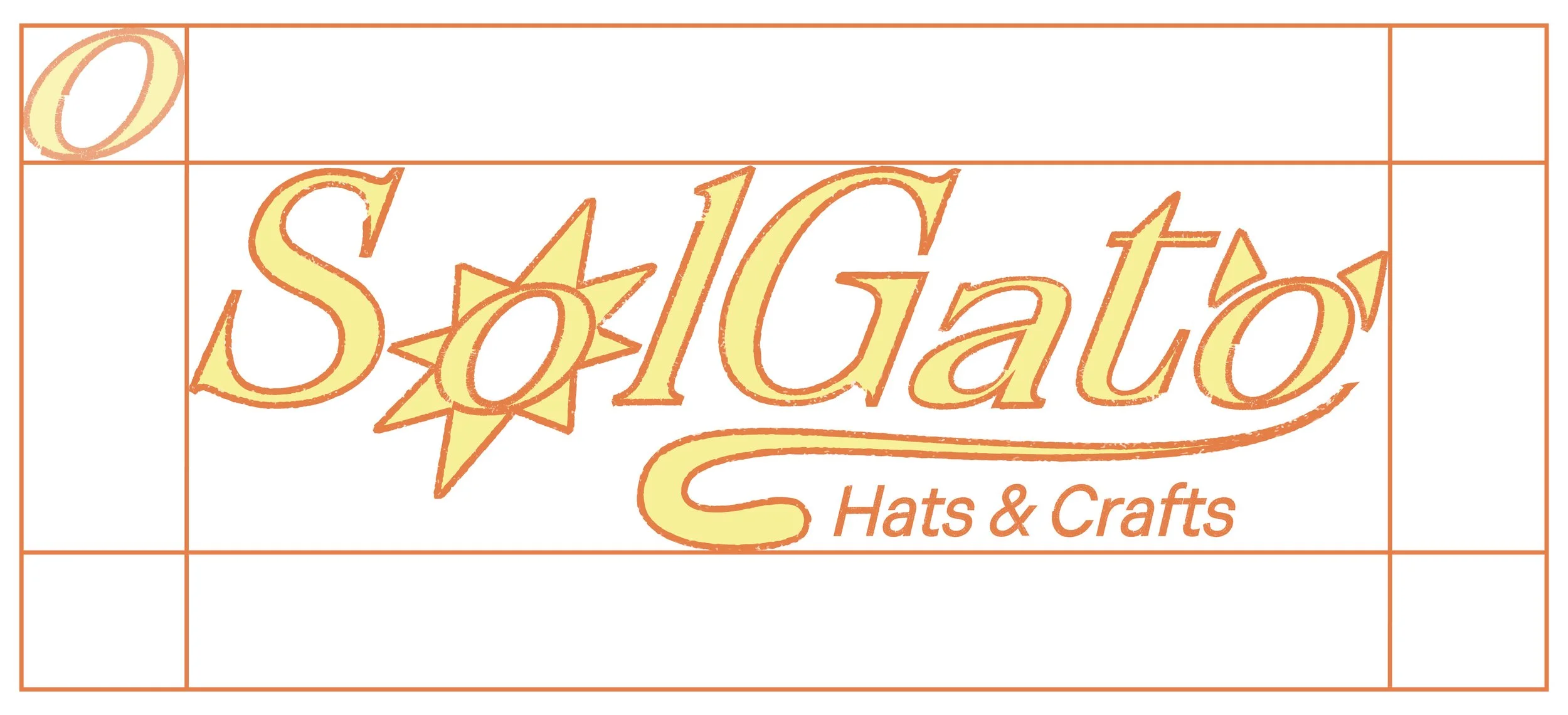
To elevate the brand from its earlier rounded, soft-edged look, the updated wordmark transitions into a bold, italicized typeface that exudes confidence, motion, and visual impact. To balance this high-energy primary font, I paired it with a clean, grounded sans-serif for secondary text.