
Typeface Posters
Every typeface has its history, personality, and slight differences. The objective of this project was to highlight the individuality of each one and create posters based on their unique history. To demonstrate their identity, I limited myself to using only their characteristics to create the designs. These posters would be sold to font enthusiasts and would come in a package with information cards giving a brief history of the typefaces and a bookmark as an extra.

Original
At first, I thought I was limited to the typeface’s letters, but I kept the constraint as a personal challenge. Drawing from Sabon’s roots in Claude Garamond’s 16th-century typefaces, I shaped the design’s aesthetic around that era.
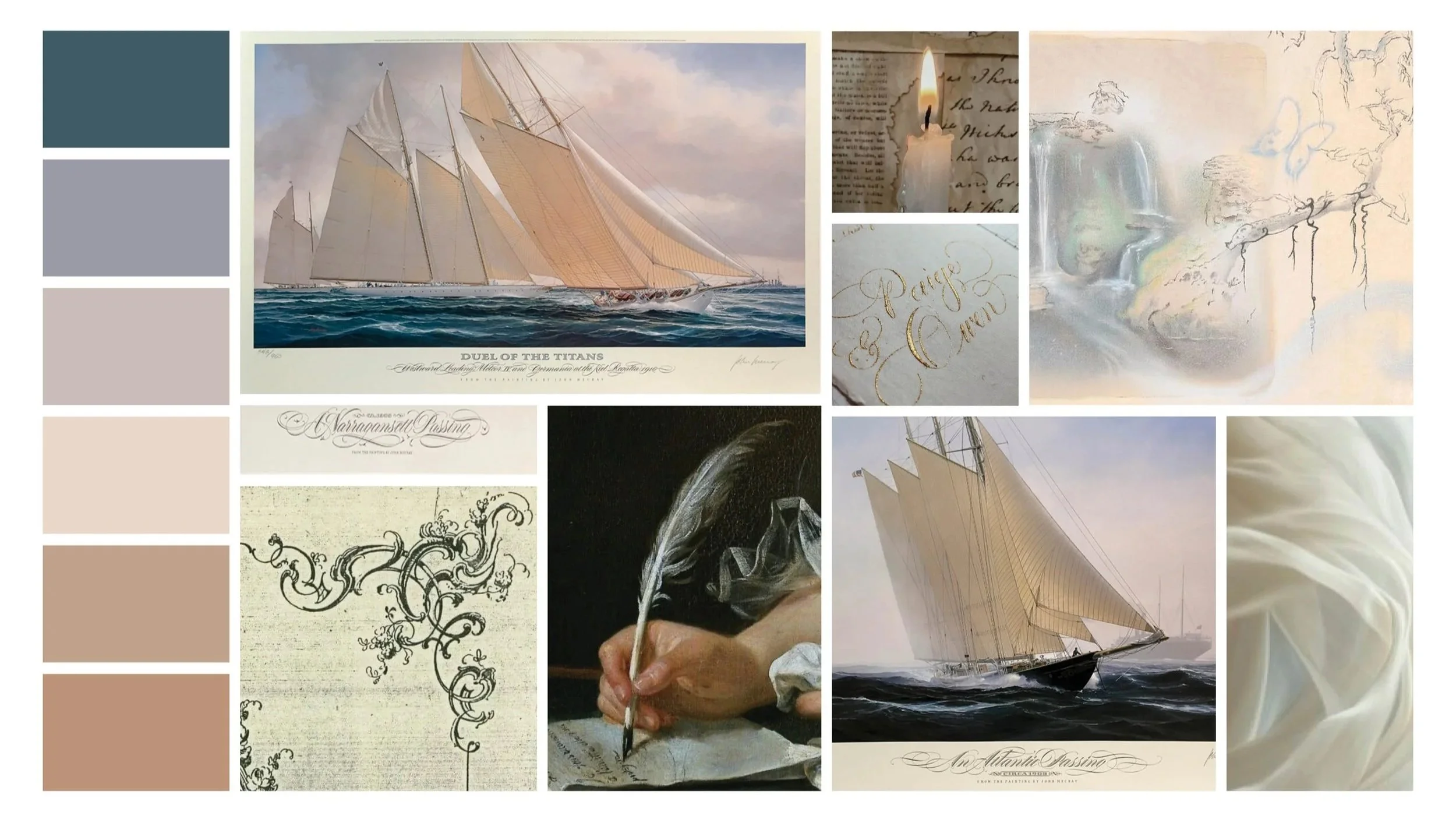
Moodboard & Sketches


Revised
I revisited the design with my improved skills, refining it while keeping the original layout. I updated the colors to create a smoother flow and ensure the key content stood out more effectively.

Although the plan was to design four font posters, the short timeframe allowed me to complete only two. However, I also created a bookmark and an information card highlighting the history of each typeface.
Moodboards:

Sabon

Rotunda Veneta
Sloop Script

Carta Marina
Final Products


