

Stitch Fix | Restitched
Sustainably Crafted, Personally Tailored
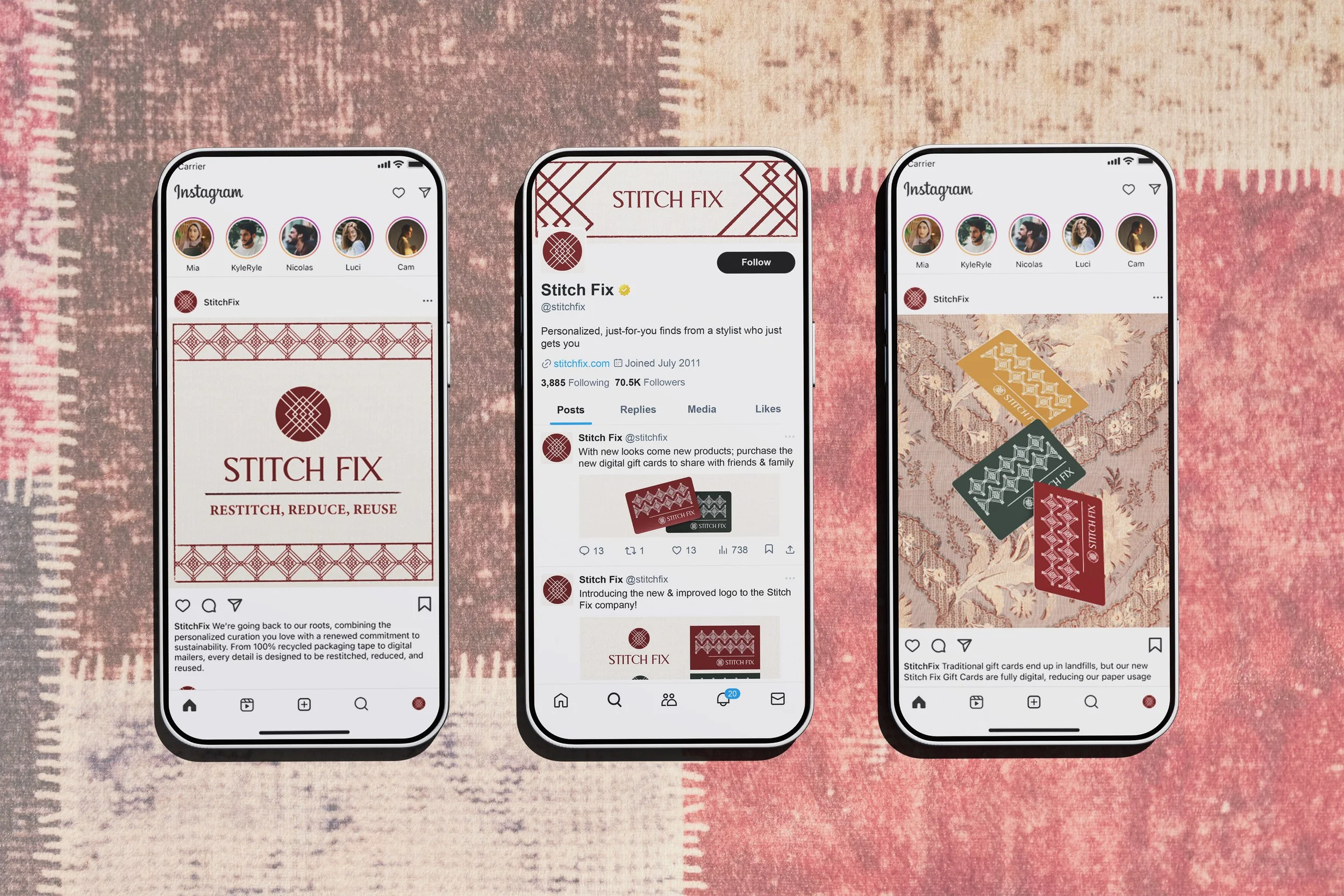
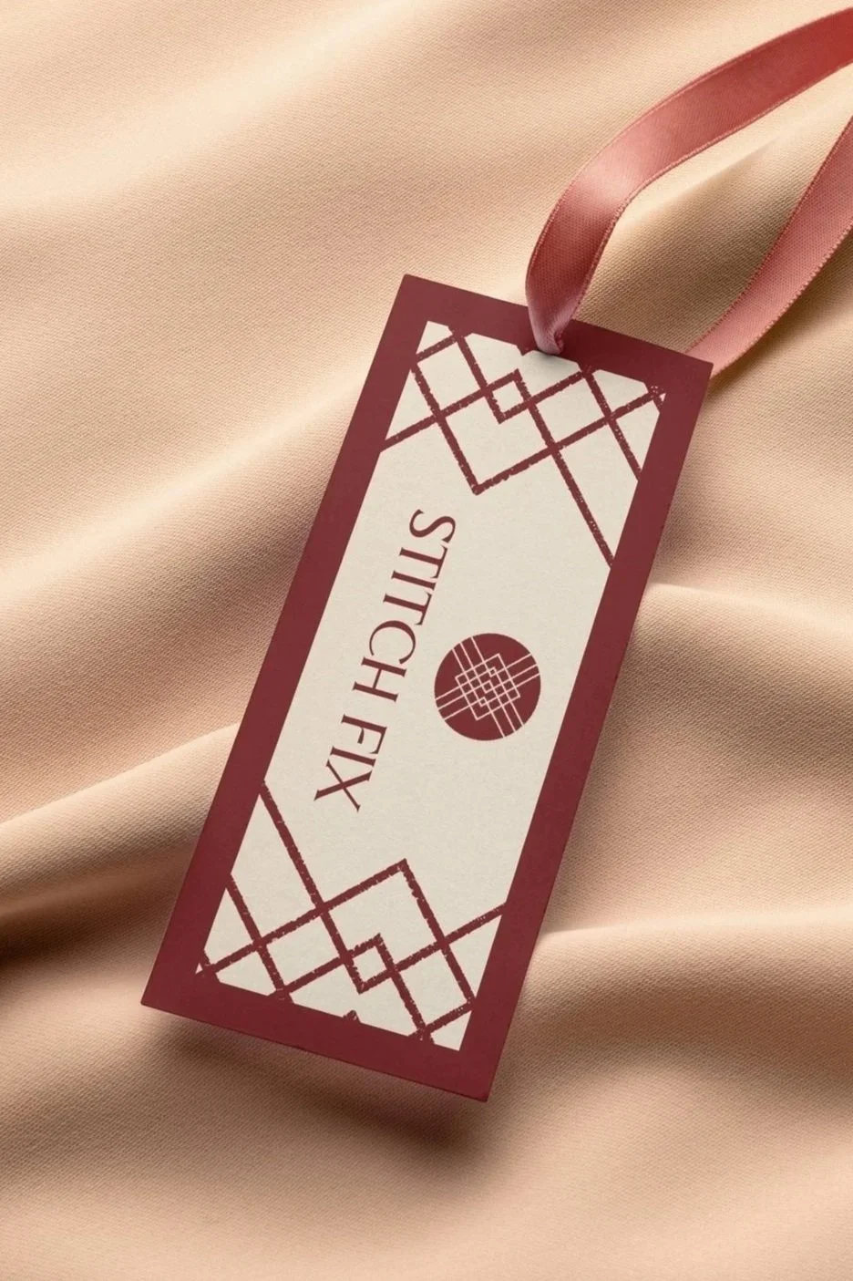
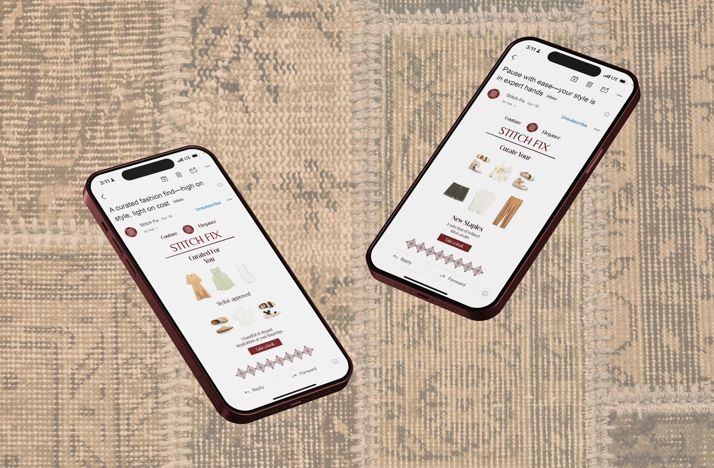
As Stitch Fix shifts toward a modernized, sleek identity, this project reintroduces the brand’s organic roots through tactile, sustainable touchpoints. The rebrand strategy leverages recycled packaging, an elevated luxury palette, and a cohesive social layout to balance modern sophistication with visual warmth and eco-friendly design.







Early Exploration |
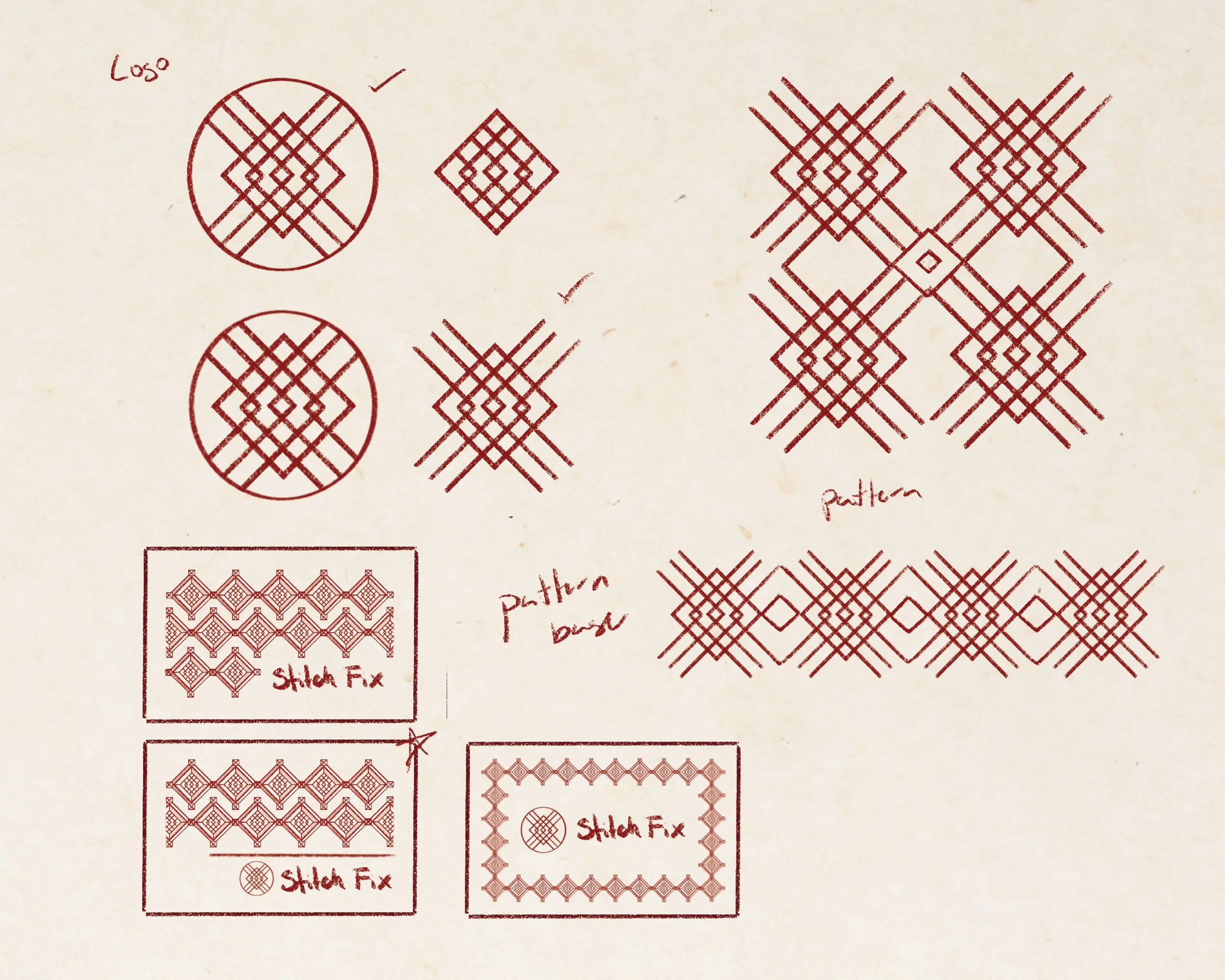
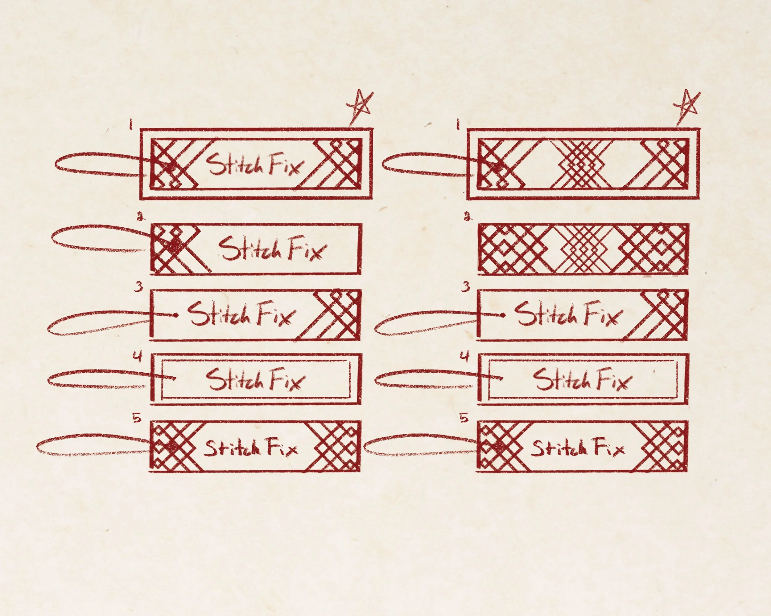
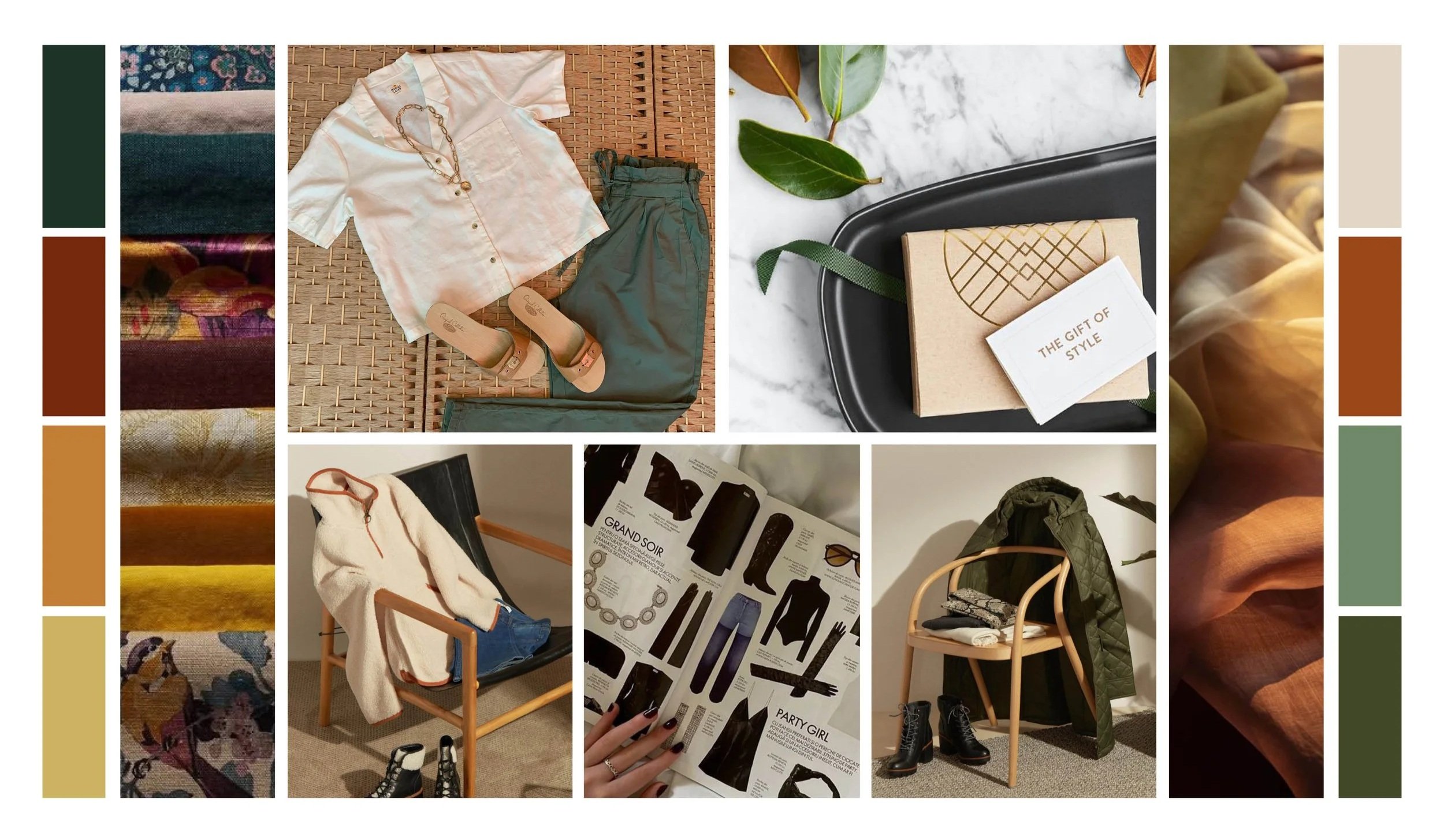
While the initial logo concept provided a strong foundation, the sketching and moodboard phase focused on harmony and extension. My goal was balancing bold geometric elements with tactile textures and a rich palette to form a cohesive, versatile design system.
The Rebrand Structure |
Rooted in Heritage & Pattern
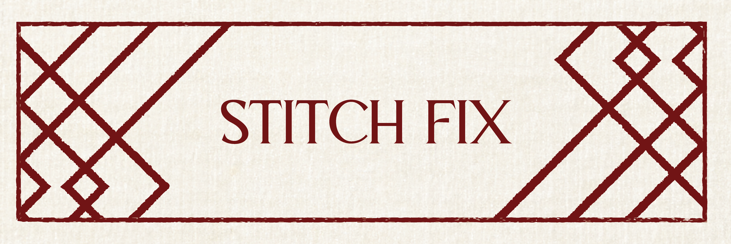
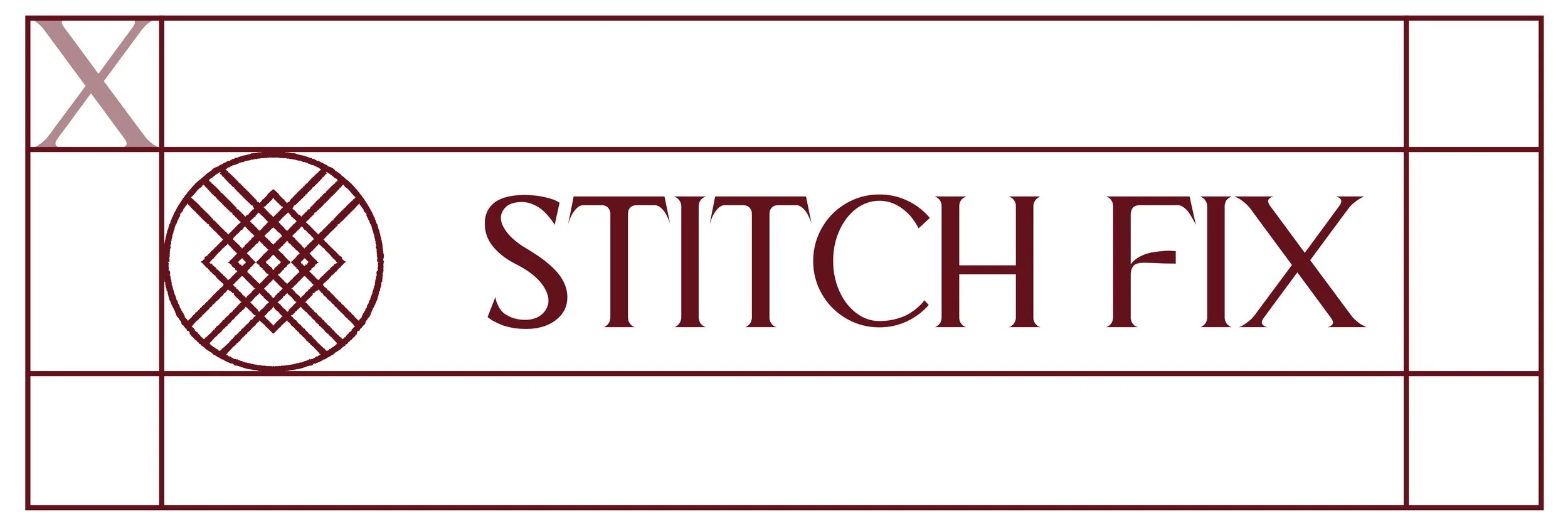
The updated logomark draws inspiration from Stitch Fix’s original custom script, reintroducing its human touch through refined supporting patterns and modern geometric elements.

Elevated Color Strategy
To shift the brand toward an elevated, luxury aesthetic, the new palette centers on rich burgundy, muted yellow, and forest green. These earthy tones, selected for their timeless warmth and versatility, effortlessly pair tactile, eco-friendly kraft packaging with premium digital elements.
Impactful Typography
The new typographic identity pairs bold, structured letterforms with crisp apexes and sharp points. This adds commanding visual presence across digital feeds and physical print collateral, ensuring the brand remains distinct whether stamped on recycled packing tape or viewed on screen.
Logo Evolution |

Original
Having grown up watching my mother unbox Stitch Fix deliveries, this original mark always held a memorable, personal charm. Its custom, script-like quality made the unboxing experience feel like receiving a package from a personal friend or stylist, wrapped around the side of the shipping box.

Current

The recent redesign modernized and simplified the mark, attempting a subtle needle-and-thread abstraction. However, in streamlining the graphic and shifting the vibrant turquoise to a muted, lower-contrast shade, the identity lost much of its original warmth and legibility.
My Version
To bridge legacy with modern sophistication, I refined the intricate lines of the original mark, allowing the design to breathe while reducing visual clutter. Paired with a bold typeface and a rich burgundy palette, the updated logo restores a sense of luxury, clarity, and personal connection across both digital screens and eco-friendly packaging.